
Designing Banner Inserts That Work on Desktop and Mobile
One of the most common questions is:
"Where do I put my text, logo, and button so the banner looks good everywhere?"
The good news is that you don't need to think about crop zones, percentages, responsive design, or graphic design theory.
The Marriage Assessment banner below is an excellent real-world example.

The Banner Artwork
The original banner was designed as a wide horizontal image.
LAYOUT
Left Side
- Illustration
Center
- Headline
- CTA Button
Right Side
- Logo
This is the ideal structure for a Godcaster banner insert.
How It Appears in the Web Player
In the desktop web player, the entire banner is visible.
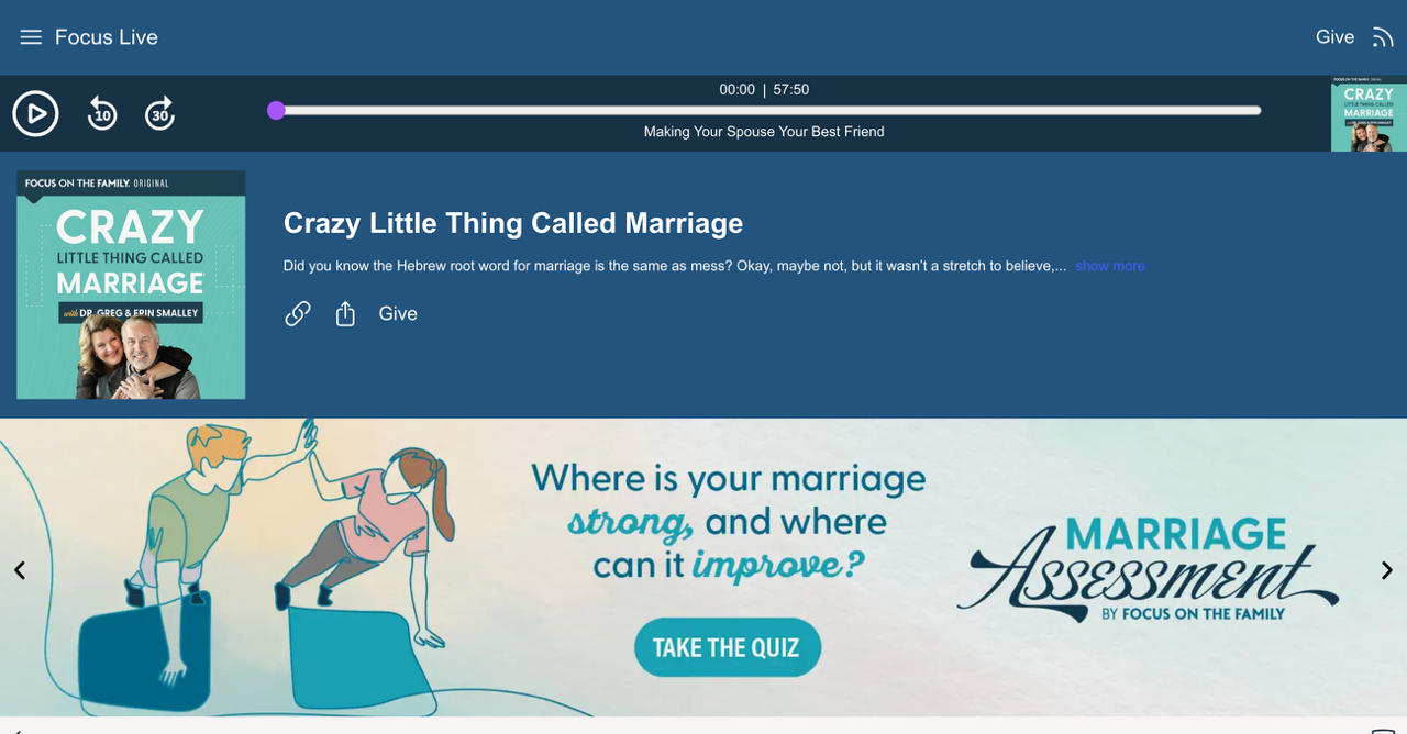
What the listener sees
- The illustration on the left
- The headline in the center
- The Take the Quiz button
- The Marriage Assessment logo on the right
Everything is readable and balanced.
The banner takes advantage of the full width available on larger screens.
How It Appears in the Mobile App
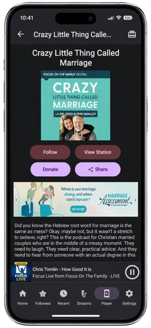
In the mobile app,the same banner becomes much smaller.
Notice what still works:
- The illustration is still recognizable
- The headline is still readable
- The CTA button is still visible
- The logo is still visible
Nothing important was placed against the extreme left or right edge, so the banner remains effective even when displayed at a smaller size.
The Simple Rule
When designing a banner insert, think of the banner as three sections:
[ Image ] [ Headline + CTA ] [ Logo ]
Left Section
Use for: Photos, People ,Artwork ,Illustrations
Center Section
Use for: Headlines, Calls to action, QR Codes, Buttons
Right Section
Use for: Logos, Branding Supporting artwork
Why This Works
The Marriage Assessment banner follows this formula almost perfectly.
[ Illustration ] [ Question + Button ] [ Logo ]
Because the important information is distributed across the banner instead of being pushed to the extreme edges, it works well on: Desktop browsers, Tablets Mobile phones, Godcaster Web Players Godcaster Station Apps
Recommended Specifications
Image Size
Recommended:
3000 × 600 pixels
Acceptable variations:
- 2936 × 622
- 3000 × 625
- Similar 5:1 ratio images
Format
- JPG
- PNG
File Size
- Under 2 MB recommended
Before You Upload
Ask yourself these four questions:
- Can I clearly read the headline?
- Can I clearly see the button or CTA?
- Can I clearly recognize the logo?
- Does the banner still make sense when viewed small?
If the answer is yes, your banner is ready for use.
A Proven Formula
If you're not sure where to start, simply follow this layout:
PHOTO > HEADLINE/CTA > LOGO
This is the same approach used by the Marriage Assessment banner and is one of the most reliable layouts for both desktop and mobile listeners.